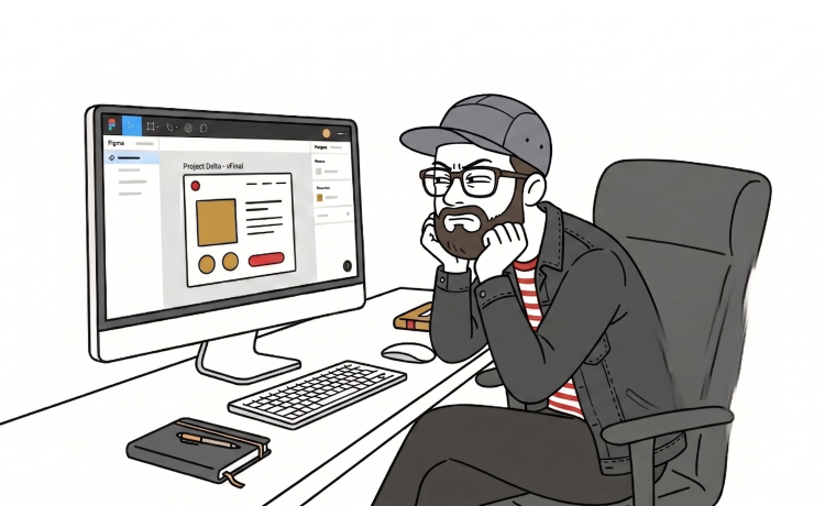
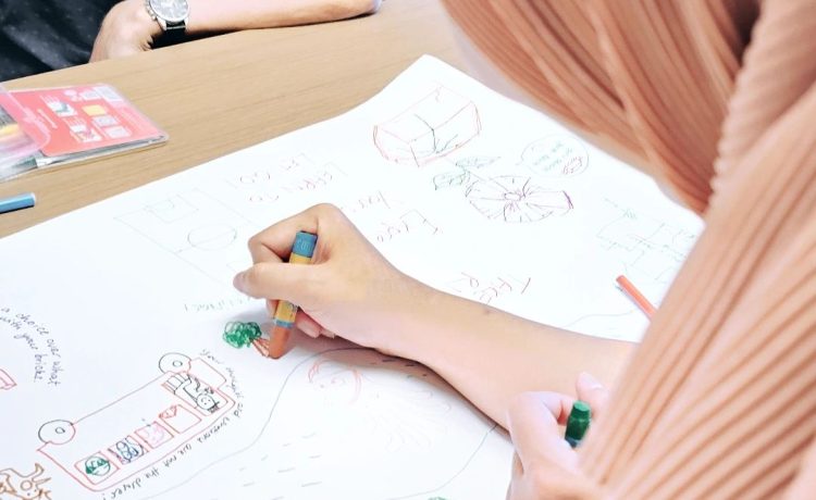
Posted by Zana Fauzi on January 9, 2012

“Pixel perfect vector nudging. Now say it fast.”
In between managing the team, cycling around her neighborhood and coping up with recent losses (both father and father-in-law), Zana is ready to lead the team to face 2012 with all our awesomeness. Zana is the Project Manager at Stampede.
I could say that 2011 was a crazy fun year for the team. A hefty load of projects landed on our laps – the team worked hard day and night (in between cracking jokes and devising tomfoolery, well of course.). Hence the lack of blog posts. But fret not, we have got a couple of posts lined up for the coming weeks – so stay tuned!
In the meantime, check out this fantastic post on pixel perfect vector nudging for Photoshop – try saying it a couple of times – pixel perfect vector nudging pixel perfect vector nudging – fast!
And does anyone fancy making some ice cream clouds?
Posted in Inspiration, Made Us Excited! Add Comment »
Posted by Mujib Jazmin on November 5, 2011

“I ♥ iOS5, I’m OK.”
Resident Apple fanboy, Mujib was stoked with the roll-out of iPhone 4S and iOS5. Mujib Jazmin is the Junior Web Designer at Stampede.
You know it was meant to be the day I decided to acquire my first iPhone ever. It was a beautiful sunny day somewhere in 2009 and I was queueing up with a handful of others at the Apple store, giddy to own a newly launched iPhone 3G. Once the shiny new wonder machine found its place in the curves of my palms, I was at awe. I spent hours testing out the features, guided with the instructions manual (which was pretty brief anyway) and many many bytes of Googled web pages. I slept clutching it to sleep. It was love at first touch.
When you fell in love and the feeling was reciprocated (yes the iPhone loved me back, I was sure of it), you began the stage of getting to know each other. As with many other Apple devotees, the collection would extend. I got myself a Macbook Pro 15″, an iPhone 4 (in yet another lengthy queue outside the Apple store), an iPad 2, an iPod Nano as well as a couple of other accessories. I once had a sleek iMac 21″ and traded it for my stark gorgeous Macbook Pro, which further enabled me to go as mobile as possible with its durability and brilliant battery life, not to forget its steely performance.
What made me would never turn back was when I surprised my girlfriend with an iPod Nano for her birthday present. The look on her face was priceless – and I knew I had a friend for life in Apple – both the products and its vision.
My journey as an Apple fanboy began!
But what am I rambling about – of course, this is not about me. What I initially wanted to convey was the introduction of iOS5 and how it changed my life. Much to the chagrin of my fellow teammates who are mostly Androiders, I kept chattering about the features until Zana the project manager twisted my arm and told me to pen this blog post down to share my take on iOS5. A little bit late to the iOs5 blog updating bandwagon, but here goes.
iCloud? iLike!
1. Notifications center

Notifications used to be sent in a popup window in the middle of the device – and there was no collation of all notifications. With notifications center placed on top of the screen (you can customize this in Settings) I will no longer miss any notifications. With a single swipe on the top of the screen, all the notifications for my chosen applications will be shown there.
2. iCloud
iCloud refers to Apple’s newest cloud service of which you could store your music, apps, photos, calendars, documents and many more. The service then will wirelessly push all of these to every device you own – no more cables needed. And it comes with a free 5 GB account!
3. iMessage

Move over, BBM – here comes iMessage! Much like BBM, iMessage is messaging application between iPhone/ iPod/ iPad users. For interaction between iPhone users, you can use the phone number of your iPhone and the Apple ID linked to the device, while for iPod and iPad, you can use the Apple ID – much like the existing Facetime.
4. Twitter integration

My traditional way of sharing articles from mobile Safari to Twitter is by having to copy the URL first and then paste it into the Twitter status update field. With this feature, I can share articles to Twitter in a single click.
5. Safari Reader
Safari Reader feature offers a less-distraction reading experience on my Apple devices. Mobile Safari now also has Tab options on much like the traditional web Safari.
6. Wireless sync to Macbook/PC over wifi connection
Perhaps this is my most favorite of all. Let’s say when I update my music library, I don’t have to plug in my iPhone/iPad to my Macbook/PC to sync the files, instead I would just leave and it will automatically sync – for example during overnight charging, so next morning I will have my music library updated in my iPhone/ iPad. Yay!
7. Multitasking gestures on iPad
By just using four or five fingers, swipe up to reveal the multitasking bar, pinch to return to the Home screen, and swipe left or right to switch between apps. Isn’t it cool? You can see it in action here.
8. Reminder app

I have been told I forget a lot, with the reminder app on iOs5, I can keep track of every tasks complete with alarms. This actually helps a lot especially to remind me about my design milestones.
9. Maps with alternate routes
I no longer have to stick to just one route to drive to one place, the new map which comes in iOs5 offers a couple of alternate routes for me to choose.
10. Camera
Now you can pinch-to-zoom gestures, and single-tap focus. Then press the volume-up button to snap your photo in the nick of time. No more fiddling with just one button to take pictures and whatnot.
Battery consumption is… meh.
While all things may seem all rainbow and ponies, a couple of things do come up in my cons list for iOs5.
First would be the noticeable, significant battery drain than during the usage in the previous operating systems (here’s something which could help). Second would be lack of design change – the iOs interface is looking really long in the tooth. The last one would be that there is no improvement in voice control at all, and I say this is a shame.
Other than that, everything works pretty much dandy for me.
“Siri, can you do the designing for me while I go play Battlefield 3?”

Last but no least, here comes the personal assistant with attitude named Siri on iPhone4s. Siri could be a reason enough to buy the new iPhone 4S. Watch Siri in action and read her antics at Shit Siri Says.
( Photo credits: 1, 2, 3, 4, 5, 6, 7)
Posted in Made Us Excited!, User Experience Add Comment »
Posted by Zana Fauzi on October 12, 2011
“God is in the details.”
Zana had the chance to sit with her awesome team throughout the 30-hour deployment for the new look of Go Eastern Eagles & is now stoked to share the nitty-gritty details of what makes the site so special. Zana is the Project Manager at Stampede.
I probably quote people way too much in each of the blog posts I have written, but you could not deny the truth behind the German born American architect, Ludwig Mies van der Rohe’s quote. Let me elaborate it further in the post.
A little bit of background for Go Eastern Eagles and the project itself: Go Eastern Eagles is a an athletic division for Eastern University in Pennsylvania. The website facelift is part of a rebranding effort for the university, done in collaboration between Stampede Design and our partner, Farotech. The deliverables for this second phase include web design, Joomla restructuring and XHTML/CSS styling.
Then:

… and NOW!
Having had the chance to sit throughout 30 hours with the team to deploy the new look, I decided to interview them to find out of the new features as well as challenges and the new things they learned and implemented along the way. I was even more delighted (the client loves it too!) to discover that the website is packed with minute details of UI and features – the little touches that made all the difference. Here I list them all according to the scope of work.
I sat down with Shaza to chat on the new design features for the website. “The primary purpose of the redesign is to employ Eastern’s new branding while introducing improvements to the 4-year old UI.” she chirped as I was typing away her comments. “The new design amplifies the website’s core purpose, which is to deliver sport updates to Eastern fans, real time. We make better use of space above the fold, so when people first lands on the homepage, they are able to navigate quickly to a particular sport, pull latest game results, plan for the next game, and read most recent article and media highlights.”
“The bigass menu – as christened by the programmers – is actually something pretty challenging to design from a UI perspective. How do you maintain a information-laden panel accross 11 different sports, some further divisible into men/women categories? We went through quite a number of iteration with the client before finally decided on the tab-within-a-tab interface. It works because it follows a natural order of sports categorization – something fans are already familiar with.”
“My favourite part of the bigass menu is how it quickly defines a sport. As you move from one sport menu to the other, you’ll see that your eyes become trained at the near-center piece – article image unique to each sport. This is the identifier user subconsciously seek for when rapidly switching between the tabs. And because all Eastern news come with at least one image, empty thumbnail will not be an issue that breaks the rhythm.”
“Weight distribution is also important here, cause you don’t want everything to end up feeling awfully heavy on the left, especially when schedules are not posted for seasonal sports. Having schedule framed in an Eastern maroon tint gives a the entire menu an ideal visual balance.”
I had to tell her to slow down as she pointed me out to this – a much better UI for switching between sports. “All it takes is a glide of your finger on your trackpad or just to move your mouse around.”


Shaza added, “A new section called news and highlights is introduced for each sport – as you can see here.”

“.. also the media section – video and latest photo gallery for each sport – is now more accessible.”

“Another exciting part of my job is to extend Eastern’s branding as identifiers to both women and men’s sports.” Shaza said. “There are now a number of visual distinctions between the two. We maintain the same layout for each sport’s homepage with two visible difference – the logo now reflects the sports you’re viewing – so you’ll always retain a sense of structure throughout your entire visit (and Eastern has thousands of pages worth of game details)…”

“…and the second is we also introduced two color scheme by sampling the two extremes of Eastern’s original maroon. Men’s sports now dons a muted, almost grey maroon and Women’s sports a flash of hot pink. Just so befitting to each gender’s personality, don’t you think?”
E.g. Men’s soccer:

Women’s soccer:

“As a designer, I know I can count on Shaiful and Syazwan to carry through the smallest design details and decisions. It’s a tall order but they did a really excellent job with the build.”
“No biggie,” Shaiful said when I asked him to elaborate on his deets in the development of Go Eastern Eagles website.
“The new section – as mentioned by Shaza – will also mention articles which are non sports-related. Things like new coach for a team as well as alumni updates.”
“Since we have made media section more widely accessible, I have set up a system on how the photos in the photo gallery are pulled. It will scan the latest articles in each sports for 8 images, which will then check for duplicate images so they will not appear twice in the series and render the thumbnails from there. These photos will be cached so in the future if they are to be read again, it will compare with this cache and will load a lot faster.”

“The scroller on top of the site itself is packed with delicious little big details,” Shaiful added in his usual casual manner.

1. The team logos in the scroller are linked to the relevant teams – hence while cooking up my programming brew, I must make sure that the spelling of the teams’ names must be accurate.

2. The scoreboard not only lists the results, but also the dates of the future games in home and away format. The team who is on top of the list or whose logo appeared first represents the home team.

3. If you could see from the scoreboard, for the results for the past games – the team who won has an arrow to the left of team name.

4. Another thing to highlight is that certain sports like Golf and Cross Country use a different score and schedule format. Basically there is no opponent involved so the scores that appear is only for the Eastern team for that particular tournament. Case in point is for Golf over here.

Shaiful made programming sounds cool all over again when he said, “You see the top headlines here? They are all searchable by sports – brought to you by the power of Ajax pull, homie.”

“And you don’t want to live without social media nowadays, so we pull Twitter feed very nicely on top, as well as some social bookmark buttons from AddThis.com in every sports page.”
![]()
![]()
“Let me show you a little magic trick, Zana,” Shaiful said, snatching my laptop away from me. He opened the baseball roster page and placed the laptop in front of me. “As you hover over a player’s name, his photo will appear on the right.”

“As you scroll down to the bottom the list (and the site) and hover on their names, you will see that the picture follows you too.”

Shaiful added, “Actually this is not that hard to do, but it improves user experience a lot. Imagine having sports like baseball that keeps a big roster. There’s no practical way to view a player’s image as you move down the list. Having the pictures displayed at the same level where user’s attention is currently focused IS the way to go. This particular quirk was not apparent during build phase, but we keep open channels with our end user after deployment, both on the website and Facebook, to solicit feedback and one user pointed this to us. We rolled out the updated code quickly and was surprised that people notice the improved interaction.” Shaza finally butted in, “And as a designer, it makes me happy to hear back from user who pays just as much attention to details.”
“Another gem,” Shaiful says, grinning, “is the editor now have the option to link a highlighted article to player’s profile or any other information relevant to the article like sport stats or player’s past game. This makes a far richer audience engagement to the website. Like this case of lovely Kelby Bolton here.”

Shaiful put on his serious face back again. “In RSS Newsfeed section, you can get the links to add to your RSS reader so you will be updated without having to visit the website.”
“But anyway, these are no magic tricks. It takes a whole loads of focus, hard work, attention to details and of course team camaraderie to make all this happen.” Shaiful concluded.
Syazwan took a long time to figure out his most significant tasks for Go Eastern Eagles project, although he spent many hours hunching over his desk coding it. It is a common practice to glorify designers and programmers in a project, but truthfully, the front end guy should be given credits as well for being able to bring web design to life in sync with the programming codes. That isn’t any easy task.
“If you may know,” Syazwan began, “the entire page is run on Google Web Fonts. Arial for body tag (which means the default text for the entire site is in Arial), Play for main navigation and headings and Droid for sports navigation.”
“The entire site needs to be able to run on every browser there is out there except Internet Explorer 6 and below. This is where I need to pull out everything I have learned out of my pocket over all these years to make it cross-browsing without having to modify some HTML structures. These includes the sliders, the bigass menu, tabbing hover effect according to shapes and stuffs like that.”
“Because the HTML element is not consistent, the hardest part in my task would be to apply styling as per PSD to article page. What I did was to find the most reliable CSS selector across the article pages for styling and I found this to work quite well.”
“Needless to say teamwork plays a huge role in this project. Shaiful and I spent countless hours discussing the classes declaration over Skype to get this done. There is a hefty amount of back and forth work just to make sure the cross-browsing is executed very well. It was not easy to archive for the updated HTML version, but we have worked on this with the previous project before and we were determined to get this done.”
Syazwan tapped the end of his pencil against his laptop screen and continued, “As far as details go, I must make sure this site is as pixel perfect as possible to the PSD designed by Shaza, down to the tiniest details. I have to thank her for designing something so packed, so detailed yet very nicely organized – this makes the styling task a whole lot easier.”
Any other challenges? “On top of it all, the most important thing is the race against time as well as making sure my tasks are done within the estimation time. I don’t know if I have ever poured it all into a single project like this.”
“On a lighter note, my favorite detail implemented would be the transition of hover effect on thumbnail on homepage slider. I enjoy the little arrows in the thumbnails indicating that this is the picture on display. Aren’t they cute?”

“Other than that, everything else is pretty much a breeze.” Syazwan said, fixing his shirt collar.
We would always love to hear your feedback of the brand spanking new Go Eastern Eagles, as well as things you would like us to feature on Stampede blog. Do drop your suggestions in the comments section or send them over to zana@stampede-design.com.
Posted in Made Us Excited!, Work 3 Comments »