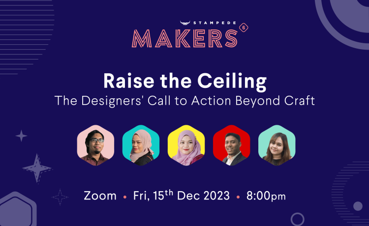
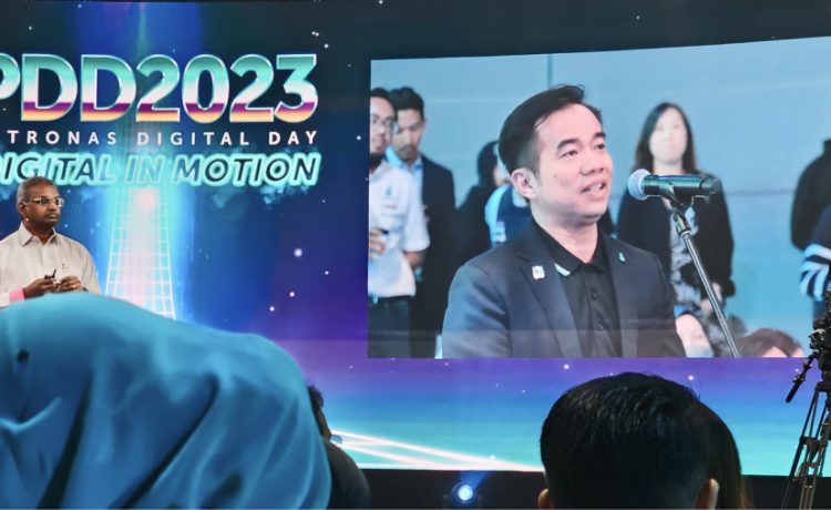
RSS

User Experience

Parallax is the new black

Posted by Mujib Jazmin on January 22, 2012

“It’s the ‘in’ thing. Every web folk should know it.”

Mujib Jazmin profile pictureMujib took the time to dissect three of his favorite websites with the infamous parallax scrolling effect. Mujib is Junior Web Designer at Stampede.

It’s official: all the guys (and the girls) in Stampede are crazy about parallax scrolling effect. It has found its way into almost every requirement and statement of work we have – it is almost like we are trying to find an excuse to use and experiment with its capability. Furthermore, it’s the in thing. Every web folk should know it.

Parallax? Well son, elaborate.

If you must know, parallax scrolling effect is like the coolest magic trick to hit the web design shores at the moment. Before this it was used widely in video games for years. According to Line25, the effect became popular when it was implemented in the background of Silverback app website. Back then it was only used as an Easter egg – visible only when the browser is resized. Now the effect has since evolved and seen as part of a scrolling feature of a web site, where multiple backgrounds seem to move at different speeds.

Hm, I am intrigued. Can you show me how it works?

You are lucky. Here I have in my sleeve is a showcase of three of my favorite websites with this effect – let me show you how awesome it is. Don’t only take my word for it – please also click on the links and experience it for yourself.

#1 – 360 Long Street Zurich

URL. Concept and design by Hinderling Volkart, Zürich, Switzerland.

If you are being observant after you are done picking your jaw off the floor, you would notice that 360 Long Street Zürich is filled with eye-catching elements. It is another one of those little big details discovery in user experience.

These bubbles in red animate as you encounter them by scrolling through the street along the way. Click on the information underlined and you will be taken to another realm – for example, another person’s room where you can further explore his/her room by more scrolling and listen to his/her favorite music.

The icon on the top right of the browser will let you experience the street life in Zürich whether it is day or night. And if you are careful enough to notice, every people we see on the streets have their faces blurred.

The parallax utilization in this website is made by extracting images from a video scene. When scrolling started, the menu on the right screen will fade out and animated video images will appear until video ends. A high resolution image will  appear when scrolling stops.

As you scroll, flying bubbles will move from the bottom to the top, in left and right curve directions.

#2 – Cultural Solutions UK

URL. Concept and design by Hoohaa Design.

Cultural Solutions UK is one of the websites with parallax scrolling effect that I had my eye on. Staying true to the nature of a designer, I could not help noticing some eye-catching elements implemented in this website.

… like these cute icons distribution to the buttons.

Or the fact that the animated background will follow the cursor along the header. (You have to give this a try yourself to see how it works.)

Not to forget the noticeable heading designed with good color contrast and excellent choice in typography.

You gotta love the scrolling news ticker for its Twitter feed too!

Unlike 360 Long Street Zürich website, the parallax utilization for Cultural Solutions UK is not that heavy and complicated. The effect is mostly applied to the menu buttons, but it is enough to add that wow factor to the website.

#3 – Smart USA

URL. Concept and design by Smart USA itself.

I believe this is my favorite out of all three. Everything in the website – the title, the description and the visuals are so appealing you wish you had worked in this.

How the parallax effect works in here that as you scroll in the homepage, the car would zoom in closer to you. In fact, most of the navigations are done by scrolling, but if you get tired of doing so, you can always click the buttons in dots at the right corner of the site.

Cool! So, how do I learn how to achieve this effect?

Parallax scrolling effect is done with the help of well-defined images, jQuery and CSS3. There are many tutorials you could find around the web – among these are ones done by WebDesign Shock, Richard Shepherd and Theme Forest. You could also go see behind-the-scene works that goes into the making of Nike Better World website, the pioneer of parallax scrolling effect in web design.

Awesome! I will go create one now!

Good luck!

Posted in Code, Design, User Experience Add Comment »

S in iOs5 stands for ‘sweet’!

Posted by Mujib Jazmin on November 5, 2011

“I ♥ iOS5, I’m OK.”

Mujib Jazmin profile pictureResident Apple fanboy, Mujib was stoked with the roll-out of iPhone 4S and iOS5. Mujib Jazmin is the Junior Web Designer at Stampede.

You know it was meant to be the day I decided to acquire my first iPhone ever. It was a beautiful sunny day somewhere in 2009 and I was queueing up with a handful of others at the Apple store, giddy to own a newly launched iPhone 3G. Once the shiny new wonder machine found its place in the curves of my palms, I was at awe. I spent hours testing out the features, guided with the instructions manual (which was pretty brief anyway) and many many bytes of Googled web pages. I slept clutching it to sleep. It was love at first touch.

When you fell in love and the feeling was reciprocated (yes the iPhone loved me back, I was sure of it), you began the stage of getting to know each other. As with many other Apple devotees, the collection would extend. I got myself a Macbook Pro 15″, an iPhone 4 (in yet another lengthy queue outside the Apple store), an iPad 2, an iPod Nano as well as a couple of other accessories. I once had a sleek iMac 21″ and traded it for my stark gorgeous Macbook Pro, which further enabled me to go as mobile as possible with its durability and brilliant battery life, not to forget its steely performance.

What made me would never turn back was when I surprised my girlfriend with an iPod Nano for her birthday present. The look on her face was priceless – and I knew I had a friend for life in Apple – both the products and its vision.

My journey as an Apple fanboy began!

But what am I rambling about – of course, this is not about me. What I initially wanted to convey was the introduction of iOS5 and how it changed my life. Much to the chagrin of my fellow teammates who are mostly Androiders, I kept chattering about the features until Zana the project manager twisted my arm and told me to pen this blog post down to share my take on iOS5. A little bit late to the iOs5 blog updating bandwagon, but here goes.

iCloud? iLike!

1. Notifications center

Notifications used to be sent in a popup window in the middle of the device – and there was no collation of all notifications. With notifications center placed on top of the screen (you can customize this in Settings) I will no longer miss any notifications. With a single swipe on the top of the screen, all the notifications for my chosen applications will be shown there.

2. iCloud

iCloud refers to Apple’s newest cloud service of which you could store your music, apps, photos, calendars, documents and many more. The service then will wirelessly push all of these to every device you own – no more cables needed. And it comes with a free 5 GB account!

3. iMessage

Move over, BBM – here comes iMessage! Much like BBM, iMessage is messaging application between iPhone/ iPod/ iPad users. For interaction between iPhone users, you can use the phone number of your iPhone and the Apple ID linked to the device, while for iPod and iPad, you can use the Apple ID – much like the existing Facetime.

4. Twitter integration

My traditional way of sharing articles from mobile Safari to Twitter is by having to copy the URL first and then paste it into the Twitter status update field. With this feature, I can share articles to Twitter in a single click.

5. Safari Reader

Safari Reader feature offers a less-distraction reading experience on my Apple devices. Mobile Safari now also has Tab options on much like the traditional web Safari.

6. Wireless sync to Macbook/PC over wifi connection

Perhaps this is my most favorite of all. Let’s say when I update my music library, I don’t have to plug in my iPhone/iPad to my Macbook/PC to sync the files, instead I would just leave and it will automatically sync – for example during overnight charging, so next morning I will have my music library updated in my iPhone/ iPad. Yay!

7. Multitasking gestures on iPad

By just using four or five fingers, swipe up to reveal the multitasking bar, pinch to return to the Home screen, and swipe left or right to switch between apps. Isn’t it cool? You can see it in action here.

8. Reminder app

I have been told I forget a lot, with the reminder app on iOs5, I can keep track of every tasks complete with alarms. This actually helps a lot especially to remind me about my design milestones.

9. Maps with alternate routes

I no longer have to stick to just one route to drive to one place, the new map which comes in iOs5 offers a couple of alternate routes for me to choose.

10. Camera

Now you can pinch-to-zoom gestures, and single-tap focus. Then press the volume-up button to snap your photo in the nick of time. No more fiddling with just one button to take pictures and whatnot.

Battery consumption is… meh.

While all things may seem all rainbow and ponies, a couple of things do come up in my cons list for iOs5.

First would be the noticeable, significant battery drain than during the usage in the previous operating systems (here’s something which could help). Second would be lack of design change – the iOs interface is looking really long in the tooth. The last one would be that there is no improvement in voice control at all, and I say this is a shame.

Other than that, everything works pretty much dandy for me.

“Siri, can you do the designing for me while I go play Battlefield 3?”

Last but no least, here comes the personal assistant with attitude named Siri on iPhone4s.  Siri could be a reason enough to buy the new iPhone 4S. Watch Siri in action and read her antics at Shit Siri Says.

( Photo credits: 1, 2, 3, 4, 5, 6, 7)

Posted in Made Us Excited!, User Experience Add Comment »

My Maybank2u Experience

Posted by See Guo Lin on January 18, 2011

Maybank2u - Malaysian's favourite online banking service

“I then clicked the back button in my browser. It didn’t take me to the previous page. Instead it says, due to security, I was not allowed to use the back button at all and the system promptly logged me out.”

See Guo Lin profile pictureIf you also use Maybank2u, you might have experienced the same thing. Guo Lin is the Web Developer at Stampede.

Malayan Banking Berhad has the most popular online banking website in Malaysia. They are also the pioneer of online banking services in Malaysia and among the first to introduce online banking facility, Maybank2u back then in year 2000. All major banks in Malaysia have since followed suit.

I have always been hoping that Malaysian websites would become better at adopting web technologies and employing smarter user experience design. I must say that despite being the most visited Malaysian website, Maybank2u does not take lead in both areas. In terms of design, it’s probably how a banking website should look, though I have seen better ones. Plus, I’m not in a good position to comment as I’m no designer.

Flashback…

Personally, I think the navigation structure is somewhat unintuitive. I remember the first time I logged into the website some four years ago and was overwhelmed by the Dashboard. There was no visual focus on banking functions useful to me. I became distracted and felt a little lost.

Does your OS come with a digital clock? If not you can use ours!

So I decided to explore one banking options after another. The first one said, quite naturally, ‘Accounts & Banking’. Clicking the link took me to a page with a secondary navigation menu on left. But hold on, what’s that about ‘Bill Payment’? I thought I saw something about bills in the homepage?

We have another link for you to pay your bill, in case the first link is, erm, down.

I then clicked the back button in my browser. It didn’t take me to the previous page. Instead it says, due to security, I was not allowed to use the back button at all and the system promptly logged me out. I felt frustrated and confused – how could the back button possible cause any security issues? (Update: It appears that the website now supports use of back button, notwithstanding their initial security concerns. I didn’t realize it until I test it again in preparation of this post.) I have tried another online banking websites before, but they let me browse the way I do, back button and all.

So I logged in again. And I saw that the homepage has a link that reads ‘Bills & Statements’ (although they meant different things). I was puzzled by the logic used by the UI designer when designing the navigation structure. When I clicked on the link, it took me to a page with a totally different main navigation structure. While the style looked the same, the main navigation structure was so out of touch that I’m certain they were built with the only integration to each other being the link.

You must click on ‘Online Banking’ first before you log out, because… you are not on an online banking site now?

I felt uncomfortable browsing a banking website patched up like this. So I decided to go back to the previous section I landed on when I first logged in, to get some bearing. Again, forgetting about the ‘security’ reason for disabling the usage of the back button in browser, I clicked on it and I was logged out again.

No, it wasn’t like this (this is when the user logs out on his own). I remembered clearly that they said I was not allowed to use the back button in my browser because it was not secure.

I couldn’t get used to how I need to change my browsing habits and got fed up by it, so I decided to discontinue exploring any further until I absolutely need to use its online banking service.

What Went Wrong?

I think what went wrong for me was:

  • Confusing navigation structure
  • Lack of visual cue on things ought to be focused on
  • Enforcement of browsing habits change

Four Years Later…

It has been four years since I started using Maybank2u and I realized that  the only thing they have improved is the support of  the cautionary back button (duh). I don’t know when the change was made because since my first or second visit, I have made myself adapt to their no-back button policy until today (damn, I feel so stupid).

Maybank2u is not the only Malaysian banking website that causes my itch, but I will save the rest for another day. ;)

P.S.:

I tried to access Maybank2u today by the address maybank2u.com.my and it didn’t work. My gut  feeling  told me it’s probably caused by one of the most common issues with Malaysian websites—the www and Only www Syndrome.

So I tried www.maybank2u.com.my. Voila, it works, and I’m right about the www and Only www Syndrome. ;)

We vow not to serve any visitors trying to reach us without ‘www’ in the web address.

Posted in User Experience 1 Comment »