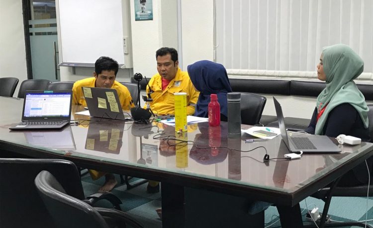
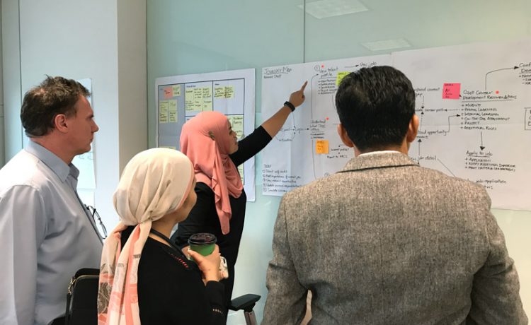
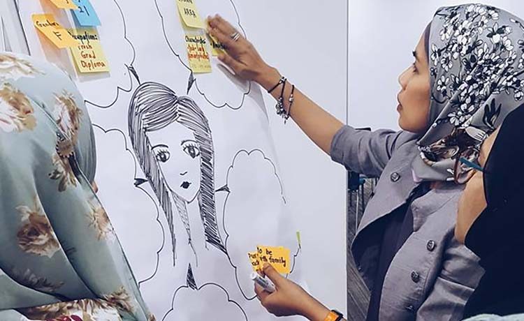
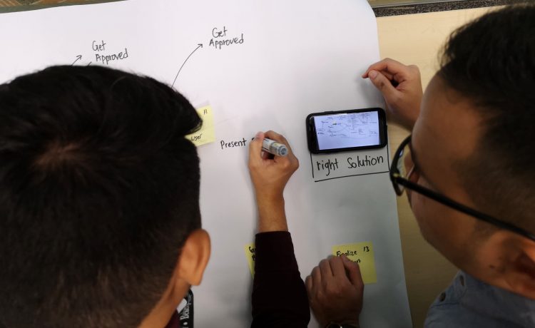
RSS

Design

Let the Fold Breathe

Posted by Shaza Hakim on August 27, 2010

“Stop worrying about the fold. Don’t throw your best practices out the window, but stop cramming stuff above a certain pixel point. You’re not helping anyone. Open up your designs and give your users some visual breathing room. If your content is compelling enough your users will read it to the end.”

- Boxes and Arrows on Blasting the Myth of the Fold

I have been planning and designing websites for quite a while now and in recent years, the same notes keep creeping into our clients’ revision request: “Reduce the header height, move sections upward, try to keep everything above the fold.

This could be a residue of the news-print industry where newspapers come folded up and the area “above the fold” must be exciting enough to compel people to purchase the paper.

We can apply the same argument to a website, whereby the fold line represents the area where vertical scrolling is required to view more content of a webpage. Instead of cramming as many “important information” into the area, try to prioritize and understand your audience. A first time visitor to your website needs a reason to stay intrigued past 5 seconds. Think of the area above fold as a compelling opportunity to entice, not overwhelm. In most cases, a simple but good, well-thought imagery and a line or two even better copy will hook enough for them to want more.

More importantly, by keeping restraint on what goes above fold, you are letting your most important content breathe.

Also remember that most people browsing the web today understands the purpose of scrolling. Every visitor to your website needs to learn quickly what your website is about, or else you’ll lose them. You will not do any better by crowding the header area – that would only dilute your message. What you want is just the right combination of visual impact and concise information. If they have quickly discovered what your website is about and now interested in the rest of your content, they will scroll to read more.

(photo by Alan)

Posted in Design Add Comment »

Launching Real Soon

Posted by Shaza Hakim on June 1, 2010

stampede-v3-sneak

Up to this hour, we’re still doing last minute removal of things from the original Stampede v3 design. With the amount of content we’re dealing with – 24 dissected portfolio pieces at last count – 8 months of detailing work on weekend and after hours don’t seem at all extravagant.

All in all, I spent around 180 hours of design time and that’s not only because of the level of complexity involved, but mostly the routine of going macro when everything is done, then removing almost half of it.

I still do incremental design change after sending the templates for Joomlafication, some so minute that only the most observant will notice. If we don’t have our own internal programming powerhouse, I can only imagine the costly bleeding.

Because this is the most ambitious project we have done for ourselves just yet, tension does run high and heated arguments over design vs code were so commonplace that when we finally come to an agreement, it was worth sitting back to take in what just happened. Such is the merry partnership I have with Dov.

It took 4 major revisions, countless minor ones, a bit of going back and forth with the rest of the team for valuable insight (whether to place this element or that on the right or left or scrap it altogether). Stampede v3 was almost a practice of convoluted layering (up to 400 at last count) to achieve a particular blend, testing out new composition for different content type, revising typography properties. Let me not bore you. Needless to say, it required plenty of patience as well.

Though I must say the only constant throughout the revisions was our signature color red. Our new logo and branding does not go through multiple iterations like most design agencies do. The branding – if you can call it that – was a split second decision of deciding what embodies Stampede. After that was decided and validated by the rest of the team, we now have a new logo, polished and all but still represents the very same identity.

stampede-v3-sneak3 Stampede has been very blessed and lucky, to say the least. We have a good score of clients who pretty much leave most design and development decision to us. We also get smart young people generous enough with their passion and time to become part of our team. I felt it’s about time for us to share values that have prevailed since Stampede’s very early days so we have designed and built a special page for this. As co-policymaker at Stampede, I probably have more fun with the Values page than most people expected.

So when v3 is finally launched, you may find it look way simpler than the actual effort – I sure hope so after the many hours spent mulling over what to safely remove and what to keep.

But then again, Stampede’s own website design has always been a sort of escapism for us from daily client requirements. It’s something we don’t do everyday and probably will never do again. For that reason alone, I know a few more days of punishing pixels is worth it.

Posted in Design, Team 1 Comment »

In A Perfect World…

Posted by Shaza Hakim on May 8, 2010

slow brown fox

Someone always has a pen

Sticker

Color

shoe

Illustrations by Catrina Dulay, California.

Posted in Design Add Comment »